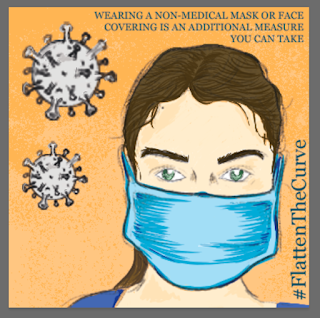
Black Mirror Storyboard- Nosedive Colour
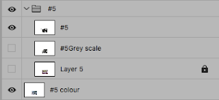
For this second half of the assignment, I was required to take these thumbnails to the next step! During the first black and white stage of the thumbnails, I had created a separate layer for line work and for greyscale shading! So that way I had saved myself a lot of redrawing to do going further into these steps! Essentially, the process was applied all the way through for each of the following thumbnails, go into the folder created for each thumbnail hide the greyscale shading layer then add a colour layer for that specific thumbnail. Like I said this technique was used for each individual thumbnail. Thumbnail 1 Thumbnail 2 Thumbnail 3 Thumbnail 4 Thumbnail 5 Thumbnail 6


Comments
Post a Comment