Posts

Covid-10 Final Colour Comp

Image
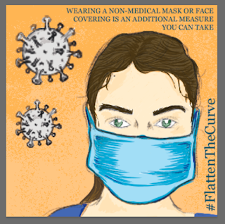
For this final step in the COVID-19 Poster was to add colour! The way I set up my previous file was so that all the greyscale values were on a separate layer then I went back into the PSD file, and created a new layer to have all my colour on this layer! I wanted to use some of the Wet Media brushes that I recently downloaded to give the overall look a more painterly feel. I wanted to use orange and blue because they're complimentary colours for each other and I tried to give the background a slight gradient feel that has an etching effect on it. Overall I enjoyed this project a lot hope we can all flatten the curve!

Covid-19 Greyscale Comp

Image
For this step in the assignment, I went ahead with a 5 by 5 dimension to make a perfect square! I started by getting my strongest thumbnail and building on that but adding the actual virus as a design element. I wanted to keep the drawing simple so it could still be effective and easily understood! I started by making a line layer which strictly just had line work on it of the main female than of the virus. After playing with the composition I created a new layer called shading and that is where I applied my grey tones.

Covid-19 Thumbnails

Image
For this next task, we were asked to create some thumbnails for the COVID-19 pandemic that is currently going on worldwide. This obviously is a very serious matter but I enjoyed creating these thumbnails. I wanted to focus on some main things that surround COVID-19. For each piece, I started with a 5 by 5 square in Photoshop, then proceed by starting with the linework and figuring out how I wanted each element of the design to be placed etc. After being content with all the linework I started a new layer and called it greyscale, this is where I added all the shading I wanted and highlights and colours all within the greyscale values. After that I created a details layer where I could play around more with different elements some were using a different brush such a pastel, or others consisted of using a lasso tool ad filling it with a colour. Final step with these thumbnails was typography. I tried to incorporate the type in a couple different ways. Some of them I tried to use type as a

Black Mirror Storyboard- Nosedive Colour

Image
For this second half of the assignment, I was required to take these thumbnails to the next step! During the first black and white stage of the thumbnails, I had created a separate layer for line work and for greyscale shading! So that way I had saved myself a lot of redrawing to do going further into these steps! Essentially, the process was applied all the way through for each of the following thumbnails, go into the folder created for each thumbnail hide the greyscale shading layer then add a colour layer for that specific thumbnail. Like I said this technique was used for each individual thumbnail. Thumbnail 1 Thumbnail 2 Thumbnail 3 Thumbnail 4 Thumbnail 5 Thumbnail 6 

Black Mirror Sotryboard - NoseDive

Image
For this week we were asked to create a storyboard of either a commercial, show or movie. I went ahead and did a storyboard of an opening scene in one of my favourite shows, Black Mirror. I started with the very first scene and for all of my images I just simply paused the show took a screen capture then used that as my photo reference! The first image is Lacie starting her morning with her usual morning run! I started with linework then added my greyscale shading after I was happy with the layout of this thumbnail. The second thumbnail Lacie stops during her run to have a little break and checks her phone immediately to see what "her" current rating is. The third thumbnail is a close-up shot of Lacie checking her phone, again for all the thumbnails I always proceeded with linework first, shading second and hilites are added lastly if necessary, which in this thumbnail I felt they were to add to the dark "grass background" In this fourth thu

Toronto Police Colour Comp

Image
For this part of the assignment, I started by getting different elements from each of my thumbnails and combining them together to create more diversity! I started by copying all the different woman I wanted to use in this picture and just arranging them in greyscale where and what size I want everyone to be! After I was happy with the layout I played with some typography that I liked and placed that accordingly as well. I then proceeded to add colour staying in the theme of blues and pop colour of yellow. Which are colours I associate police workers with. After adding the colours I know I needed to have something conceptual and fun and I thought adding a background of roads of different effectiveness and opacities would be a good way to give this design piece something interesting! At this point I can start to see the piece coming together, but I know I should definitely play around with the background more and I did by placing them different ways and different effectiv

Toronto Police Services Thumbnails

Image
For this week we were asked to take our brainstorming ideas and to further expand them into cleaner thumbnail sketches. For each sketch, we were asked to make them square shaped although the dimensions were up to us to determine providing that the PPI was 300. I went ahead and made mine 5 x 5. For each sketch I started with linework to determine the overall image, after that, I went back in and added a new layer which is where I added all of my shading. After I was happy with the imagery and shading I finally came back in and added the required typography to each thumbnail.  Thumbnail #1 Linework + Shading Thumbnail #2 Linework + Shading Thumbnail #3 Linework + Shading Thumbnail #4 Linework + Shading