Toronto Police Colour Comp
For this part of the assignment, I started by getting different elements from each of my thumbnails and combining them together to create more diversity! I started by copying all the different woman I wanted to use in this picture and just arranging them in greyscale where and what size I want everyone to be!


After I was happy with the layout I played with some typography that I liked and placed that accordingly as well. I then proceeded to add colour staying in the theme of blues and pop colour of yellow. Which are colours I associate police workers with. After adding the colours I know I needed to have something conceptual and fun and I thought adding a background of roads of different effectiveness and opacities would be a good way to give this design piece something interesting!
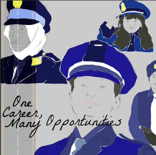
At this point I can start to see the piece coming together, but I know I should definitely play around with the background more and I did by placing them different ways and different effective. I also noticed that the type was kind of fading into the piece and wasn't standing out much so I thought I should definitely do something to define that element more, so I added some rectangles again within the blue range and put a screen filter onto it. I think that really made the type stand out much more. Overall I am happy with the final I think it is very diverse, has many artistic elements to it and I think it is visually appealing! I really enjoyed doing this assignment!


Comments
Post a Comment